Description
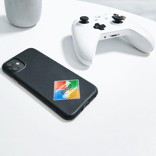
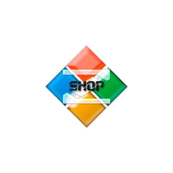
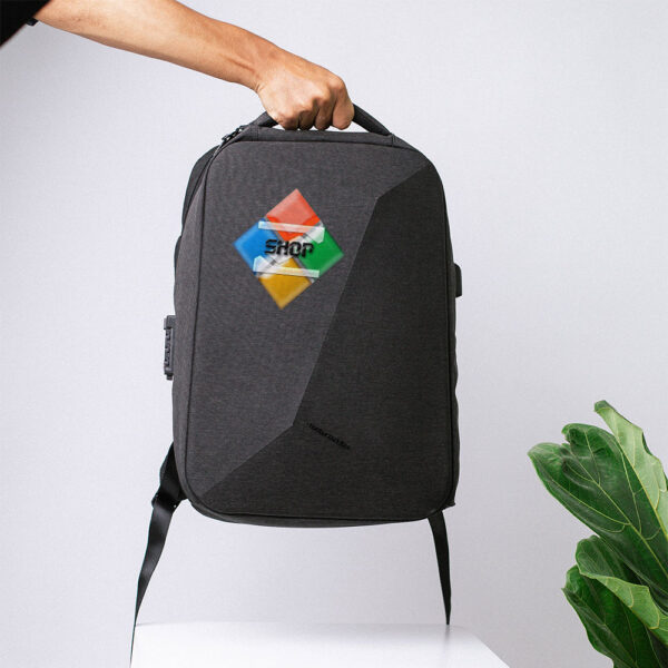
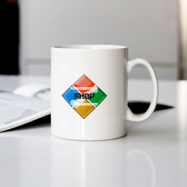
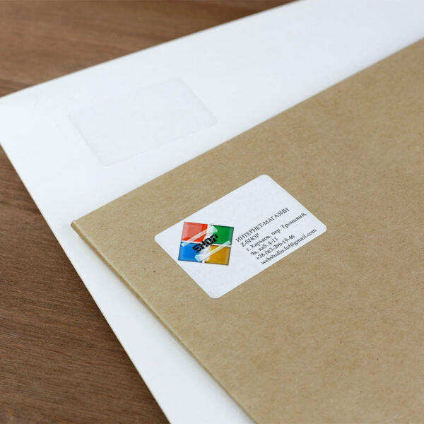
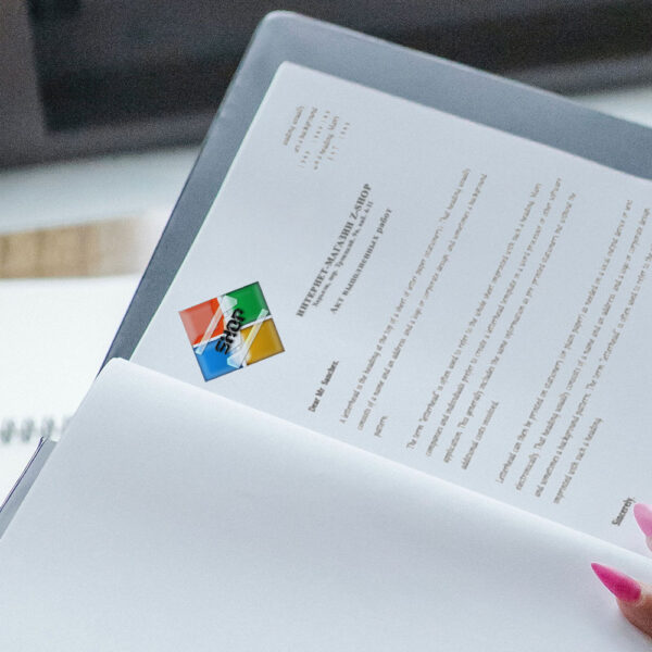
The logo that we have designed for RIZONT SHOPZ, a household goods store, is a perfect embodiment of the store’s focus on offering quality and trendy household items to customers. The logo is a colorful and eye-catching square with an upward angle, created by four brightly colored squares that form a bulge effect. This design is both modern and creative, making it ideal for a home goods store that wants to stand out in a competitive market.
The colors used in the logo are bright and cheerful, which symbolizes the feeling of warmth and comfort that one experiences in their home. Each square in the logo is of a different color, representing the diversity of the products that the store offers. The bulge effect of the squares in the logo creates a sense of depth and dimensionality, which represents the diverse range of products that RIZONT SHOPZ offers.
The capital letter in the foreground of the logo is translucent, which indicates transparency and openness towards the customers. The word ‘shop’ that accompanies the logo is also easy to read and understand, which communicates the brand’s clarity and directness.
Overall, the RIZONT SHOPZ logo is perfect for a home goods store because it represents the diversity, creativity, and warmth that customers look for in their household items. The logo is a perfect reflection of the store’s philosophy and promises to attract customers looking for unique and modern household products.
- ClientRIZONT SHOPZ
- Field of ActivityHousehold
- Development Time5 days

No comment