Description
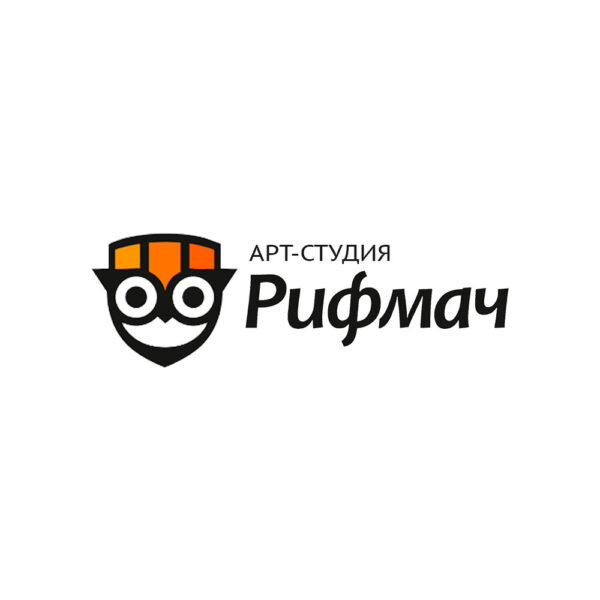
The Rifmach logo is a beautifully crafted representation of a creative poetry studio, which captures the essence of the studio’s work in its design. The combination of an owl and the studio’s name is clever and effective, as the owl is often associated with wisdom and learning, which is an important part of poetry. The owl’s cap, which resembles a pencil, is a great visual cue that refers to written creativity and scholarship. The use of shades of cheerful orange for the cap adds to the vibrancy of the logo and also conveys a sense of optimism and creativity.
The use of a graceful font in the logo’s inscription is a perfect match for the elegance and beauty of poetry, which is the studio’s specialty. The overall design of the logo is simple, yet sophisticated and is bound to attract the attention of those who appreciate creativity, learning and the beauty of words.
The Rifmach logo is an excellent example of a well-designed logo that captures the essence of a brand, which is the essence of effective branding. It is visually appealing, memorable, and communicates the message of the brand effectively. This logo is a perfect fit for the creative poetry studio, and it has the potential to become a recognizable symbol of the studio and its values.
- ClientRifmach
- Field of ActivityCreativity
- Development Time6 days



No comment