Description
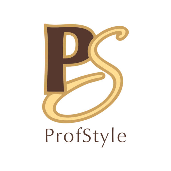
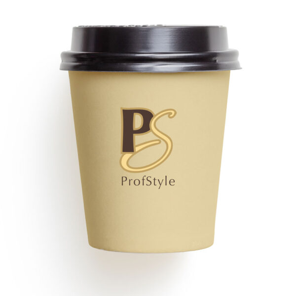
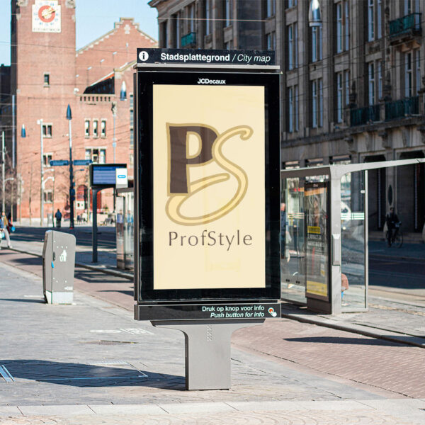
The logo for ProfStyle, the cosmetics store, is a beautiful and elegant design that embodies the essence of the store’s purpose. The two decorative letters P and S, made in contrasting colors, are the central focus of the logo. The choice of pastel brown-yellow colors, combined with the soft and rounded font, conveys a sense of elegance and sophistication that is in line with the world of cosmetics. The use of pastel colors is a subtle reminder of the soothing and calming effect of beauty treatments and cosmetic products. The serif font used in the signature gives the logo a classic and refined look, while the rounded fold lines and dots at the ends of the letters create a sense of style and modernity.
Overall, the logo for ProfStyle perfectly reflects the essence of the cosmetics store. The elegant and refined design is a reflection of the high-quality and premium beauty products available in the store. The pastel colors, as well as the soft and rounded font, create an atmosphere of relaxation and comfort, which is what customers expect when they enter a beauty store. The contrasting colors of the two letters are a nod to the wide range of products offered by the store. They offer a sense of diversity and excitement, which is exactly what customers look for when they browse through a cosmetics store. The choice of design elements in the logo is well thought out and is sure to attract the attention of customers, making the ProfStyle brand memorable and recognizable.
- ClientProfStyle
- Field of ActivityBeauty
- Development Time6 days


No comment