Description
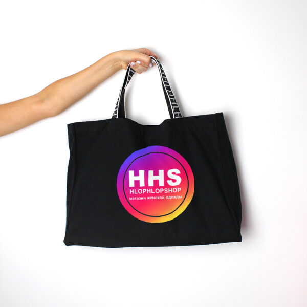
The logo that we created for HLOP HLOP SHOP perfectly conveys the essence of the store, which is aimed at modern, active and independent women. The use of the circular shape in the logo emphasizes the feminine nature of the store, as it represents softness, continuity and a sense of completeness. The variety of colors used in the logo, as well as the smooth transitions between them, is symbolic of the different moods and personalities of women, who are not limited to one color or shade.
The abbreviation in the logo highlights the store’s brand name, making it more recognizable and memorable for customers. The simplicity of the text, combined with the harmony of the line, creates a balanced and sophisticated image, which is aligned with the style and identity of the store. The addition of definition to the lines provides a modern and edgy touch to the logo, which is perfect for the store’s target audience.
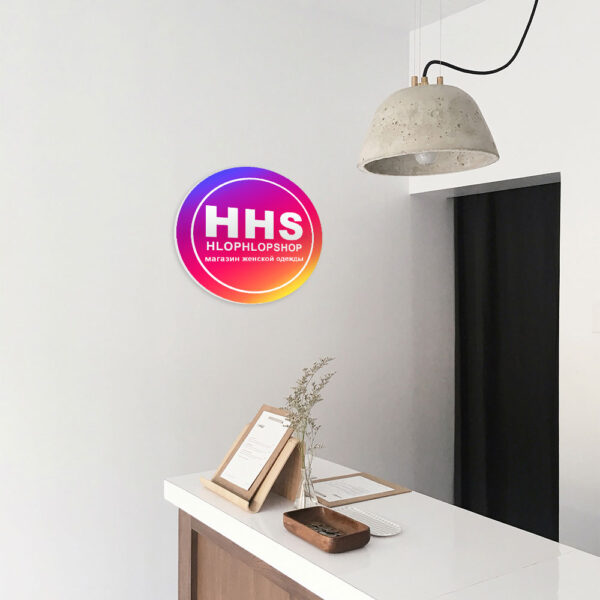
Overall, this logo perfectly suits the HLOP HLOP SHOP, as it reflects the unique identity of the store and its commitment to providing fashionable and high-quality clothes for women. The circular shape, range of colors, and use of an abbreviation makes the logo easily recognizable and memorable, while the simple text and harmonious line create a timeless and sophisticated design that appeals to the modern, stylish and confident women that the store serves.
- ClientHLOP HLOP SHOP
- Field of ActivityClothes and Shoes
- Development Time6 days



No comment