Description
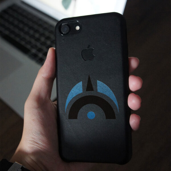
The logo created for Technotrade, a construction tools store, is a perfect visual representation of the company’s values and mission. The combination of blue and black colors signifies the company’s commitment to professionalism, trustworthiness, and quality, which are critical characteristics in the construction industry. The geometric shape used in the logo conveys a sense of strength and stability, traits that are essential in construction tools. The round elements represent the company’s expansion and versatility, while the triangle stands for its purposeful drive to deliver quality tools and equipment to its customers.
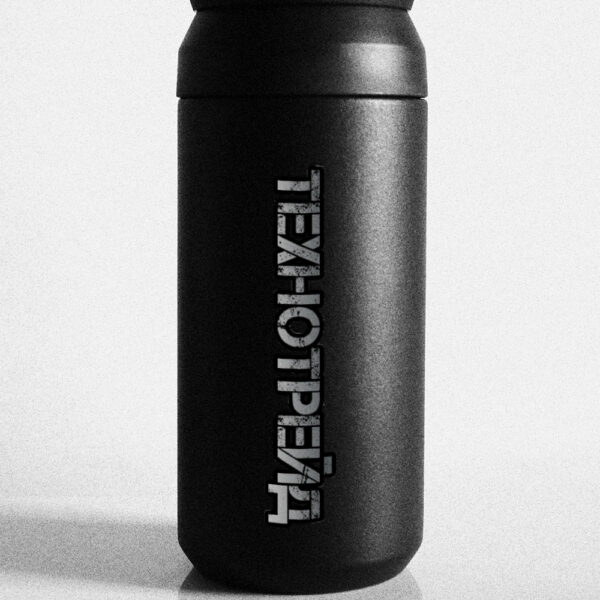
The inscription, which is made to look like a metal that has been used and bears its traces of scuffs and scratches, is an indication of the ruggedness and durability of the tools available in the store. The use of this effect makes the logo unique and sets it apart from other construction tool stores. It also reinforces the message of quality, durability, and reliability.
The logo’s overall design and color scheme are attractive, visually appealing, and memorable, making it easy to remember and recognize. It is a perfect fit for a construction tool store, as it conveys the image of a company that is reliable, trustworthy, and committed to quality products and services. Overall, the Technotrade logo is a great representation of the store’s business values and mission, and it is an effective way to create brand awareness and recognition.
- ClientTechnotrade
- Field of ActivityInstruments
- Development Time6 days


No comment